There are a few other types of charts that you probably have never heard of before. They are very useful; you would be required to learn them to become a certified Technical Analyst.

Point and Figure (P&F) Charting
A point and figure chart is a price chart that ignores time and focuses solely on price changes. It comprises a series of Xs and Os representing advancing prices (Xs) and declining prices (Os).
Point & Figure Charts are unusual as they feature no timeline along the bottom horizontal axis.
The chart is made up only of price swings. The vertical price bar is arithmetic and shows only units of price. An “O” is plotted if the price moves down a whole price unit (for example, 50 cents).
Then, when the price changes direction and moves upwards, an “X” is marked in each box. This filters out smaller price moves and lets us focus on trend quality. Trend lines are always plotted either horizontally or at 45-degree angles.
The pros of point and figure charts
There are a few pros to point and figure charts. They can help you visualize price trends, and they can help you filter out noise from your data. Additionally, they can help you identify patterns in your data.
P&F charts are an excellent tool for doing price target calculations. Simple to learn and interpret, few price patterns to learn.
The cons of point and figure charts
There are a few cons to point and figure charts. One is that they can be a little confusing to understand at first. It can also be difficult to determine when the trend has changed using these charts.
Learning this type of charting can be easiest when performing the charting by hand. That means you mark the “X” and “O” on a paper. This can also be very time-consuming. Few services offer Point and Figure Charts.
Market Profile Charts
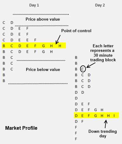
Market Profile Charts are a way to visualize the order flow of a market. They show the distribution of bids and asks over time and the volume at each price. This can help traders identify support and resistance areas and potential trading opportunities.

Developed in the 1980s by Chicago Board Of Trade Pitt Trader J. Peter Stiedlmayer. The letters on the chart show time units.
- “A” represents the first 30 minutes of trading
- “B” represents the second 30 minutes of trading.
- The point of control is the area (price range) where most trades occur during the day.
- The value area is the price range at which 70% of the action happens.
When the price is above and below the value areas, this represents a possible ideal buying or selling point.
The pros of Market Profile Charts
There are many pros to Market Profile Charts. Perhaps the most obvious pro is that they can help traders visualize the market by displaying key data points in an easily understandable way. Market Profile Charts can also help traders identify and trade with the “true” supply and demand in the market, which can lead to more successful trades.
People who use the market profile chart become evangelists for the cause. They believe it offers unique insights into buy and sell opportunities. It can be a good option if you are a quick-fire day trader.
The cons of Market Profile Charts
There are a few cons to market profile charts. First, they can be difficult to understand and use, especially for beginner traders. Second, they can be static and don’t always show the most up-to-date market information. Finally, they can be expensive since you must subscribe to a service that provides this chart type.
Stock Charts Section Summary
With the vast array of technical and fundamental data available, you have a wealth of information at your fingertips. Knowing how to use it is key. As you can see, there are many types of charts; the recommended ones are OHLC Bar, Candlestick Charts, and Price at Volume Charts. However, the choice is yours.
Read the Ultimate Updated Guide to Stock Charts

point and figure chart explained well. i decided to skip market profile charts